Table of Contents
- Executive Summary & Project Origin
- Project Scope
- Design Prototypes
- Tech stack, Figma Make and the future
- Potential Production Tech Stack (The Architectural Vision)
- The Architectural Layering
- Target User Personas & Interaction Flows
- Content Strategy & Information Architecture (IA) Framework
Executive Project Overview
| Role | Lead UX/UI & Systems Designer (Solo Initiative) |
| Timeline | 2-Week Sprint (Scoping, fluid prototyping, and technical documentation) |
| Active Design Stack | Figma (Component Properties, Auto-Layout 4.0, Fluid Typography Scales) |
| Potential Production Stack | Next.js (Server Components for static SEO pre-rendering) + Redis (Edge-cache abstraction layer) |
| The Vision | Problem: Open-access repositories suffer from severe layout fragmentation and dense text walls, drastically slowing down on-shift medical discovery. Solution: MediPulse introduces a high-density, context-aware reading system that transforms raw academic metadata into trusted, rapid-scannable interfaces across desktop and mobile devices. |
| System Constraints | • Restricted sandbox environment enforcing rigid typographic discipline. • No use of heavy client-side rendering engines (maintaining lightweight performance footprint). • Zero-budget structural execution relying on pure Information Architecture (IA). |
| Core Approach & “Hot Takes” | 1. Density Over Whitespace: Healthcare professionals do not want minimal, airy layouts; they require compact, data-dense interfaces optimized for rapid extraction under stress. 2. Physiological Navigation: Moving items out of the top header into a 56px bottom mobile touch-bar is a necessity for reliable, one-handed thumb use on a hospital floor. 3. Code-First Alignment: A design fails if it cannot scale; planning around Next.js Server Components allows text to pre-render, saving performance on slow hospital Wi-Fi. 4. Trust Signals First: Elevating DOIs, Open Access badges, and Journal Impact Factors matters infinitely more than adding decorative imagery or flashy animations. 5. Ruthless Negative Scoping: Intentionally cutting features like author manuscript submission workflows preserved the polish of the core reading experience within the 6-week window. 6. Designing for Shift Realities: Color choices must account for extreme contrast shifts—from glaring sunlight during morning rounds to pitch-black oncology wards at 3:00 AM. 7. Fluid Typography Clamping: Layouts shouldn’t roughly snap at device breakpoints; fluid text-clamping logic ensures complex medical terms scale elegantly on any viewport width. 8. Embrace Sandbox Restrictions: Utilizing strict layout sandbox limitations forces a designer to prioritize rigorous layout math and grid discipline over un-scannable visual decoration. |

Executive Summary & Project Origin
This platform was born out of personal frustration. While conducting academic literature reviews and deep-diving into research papers as a UX Researcher, I constantly collided with the antiquated digital infrastructure of open-access repositories. The primary catalyst was MDPI. While efficient at rapid publishing, MDPI’s interfaces present an immense cognitive barrier: dense data structures, cluttered reading views, and transactional interfaces that treat critical scientific literature like a marketplace commodity.
MediPulse began as an independent design exploration built for fun—an intellectual playground to see if a high-density medical ecosystem could balance complex scientific metadata with a scannable, calm, human-centric visual experience.
Project Scope
The operational scope of MediPulse was established to validate a high-density, cross-platform scientific publishing ecosystem through an intentional blueprint of eleven responsive routes. Designed to address the visual fatigue and fragmented navigation common in current research archives, the interface organizes the user experience into three distinct structural zones: discovery, consumption, and system control. The primary design deliverable focuses on transforming raw academic data schemas into a clean, scannable browser environment that supports seamless viewport scaling from mobile layouts up to desktop screens.
At the core of the active scope is the optimization of the scientific reading path, specifically mapped across the product’s core routes. The interface separates editorial updates from deeply technical manuscripts by establishing distinct layouts for general health articles and dense research papers. Each layout is engineered to surface critical trust signals—such as journal impact factors, Open Access badges, and digital object identifiers—directly inside the primary view. This ensures busy healthcare professionals can evaluate a paper’s authority immediately without digging through dense blocks of unformatted text.
To ensure rapid interface exploration while working within a controlled environment, the front-end layout relies heavily on a strictly tokenized architecture named the HealthPulse design system. Every interactive component is structured as a reusable primitive utilizing Tailwind CSS to manage complex layout constraints fluidly. The application architecture includes a persistent dual navigation strategy, utilizing a sticky top navigation bar for desktop users alongside an explicit bottom navigation bar optimized with accessible touch targets for mobile devices. This structural discipline ensures the interface maintains typographical harmony and WCAG compliance across all active application states.
Negative Scope
To maintain product focus and preserve design momentum during this exploratory phase, clear functional boundaries were established to exclude heavy backend administrative workflows. The scope completely bypasses the complex ecosystem of manuscript submission pipelines, author peer-review dashboards, and editorial review panels. By focusing entirely on the reader’s information intake, the project avoids the heavy structural demands of multi-party document editing and backend submission routing, keeping the system optimized purely as a content delivery platform.
Additionally, the system intentionally omits the development of a native, in-app PDF rendering or annotation engine, which typically introduces significant processing overhead and layout fragmentation on mobile devices. Instead of forcing users to interface with rigid documents, the scope is confined to structured text translation, abstract serialization, and layout-driven metadata extraction. Complex enterprise mechanisms—such as institutional Single Sign-On integrations, subscription paywalls, and financial payment gateways—were also excluded to maintain a lean open-access framework centered on user readability.
Design Prototypes
To provide a fully transparent, cross-platform audit of the platform’s user experience, this section presents the interactive design instances of the MediPulse ecosystem. These viewports embed live, functional prototype instances directly from Figma, allowing stakeholders to evaluate the scalability of the HealthPulse design system across different screen sizes. By interacting with these panels, you can directly test how structural spacing, typographical hierarchies, and accessible touch targets shift gracefully between high-density desktop setups and constrained mobile windows while maintaining total system cohesion.
The Desktop Workstation Instance
The desktop deployment focuses heavily on streamlining data-heavy exploration and reducing cognitive load during extended research sessions on large monitors. This design instance showcases an expansive layout optimized for the multi-tab, information-dense workflows of academic and industrial research professionals. By leveraging the wide horizontal real estate, the interface maintains persistent side panels for advanced filter modifications, exposes comprehensive metadata blocks—such as journal impact factors and DOI links—and displays multi-column results arrays without cluttering the screen or inducing visual fatigue.
The Mobile Viewport Instance
The mobile deployment targets rapid scannability and quick information access for healthcare practitioners moving quickly through active clinic shifts. This design instance compresses the dense academic structure into a highly responsive, single-column framework optimized for one-handed thumb interaction. To maximize valuable screen real estate and lower interaction friction, the layout condenses complex macro-filters into an accessible slide-up sheet drawer, anchors primary routing to a persistent 56px bottom touch-target navigation bar, and utilizes fluid fluid text-clamping mechanics to safeguard readability under stressful or highly dynamic clinical lighting conditions.
Tech stack, Figma Make and the future
Because this project was developed as an independent exploration, I utilized Figma Make to quickly bridge the gap between design and interactive code.
Hiring managers often want to see how a designer handles technical boundaries. In this section, you explain how working within a closed low-code environment forced stricter UX discipline:
- Enforced Consistency: The sandbox environment restricted arbitrary UI changes, meaning I had to rely perfectly on atomic components and rigid structural layouts.
- Focusing on the Core Path: Instead of getting distracted by building custom interactive widgets that the low-code engine couldn’t support, I channeled my energy entirely into refining the layout’s typography hierarchies, spacing scales, and data scannability.
Potential Production Tech Stack (The Architectural Vision)
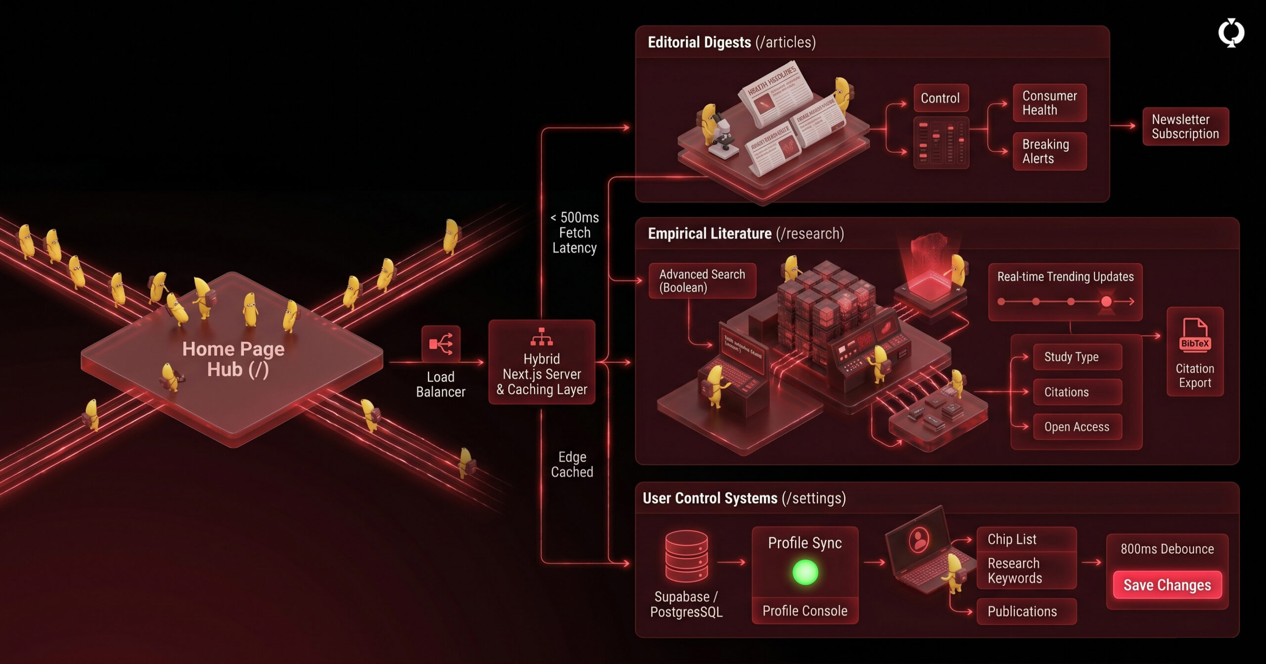
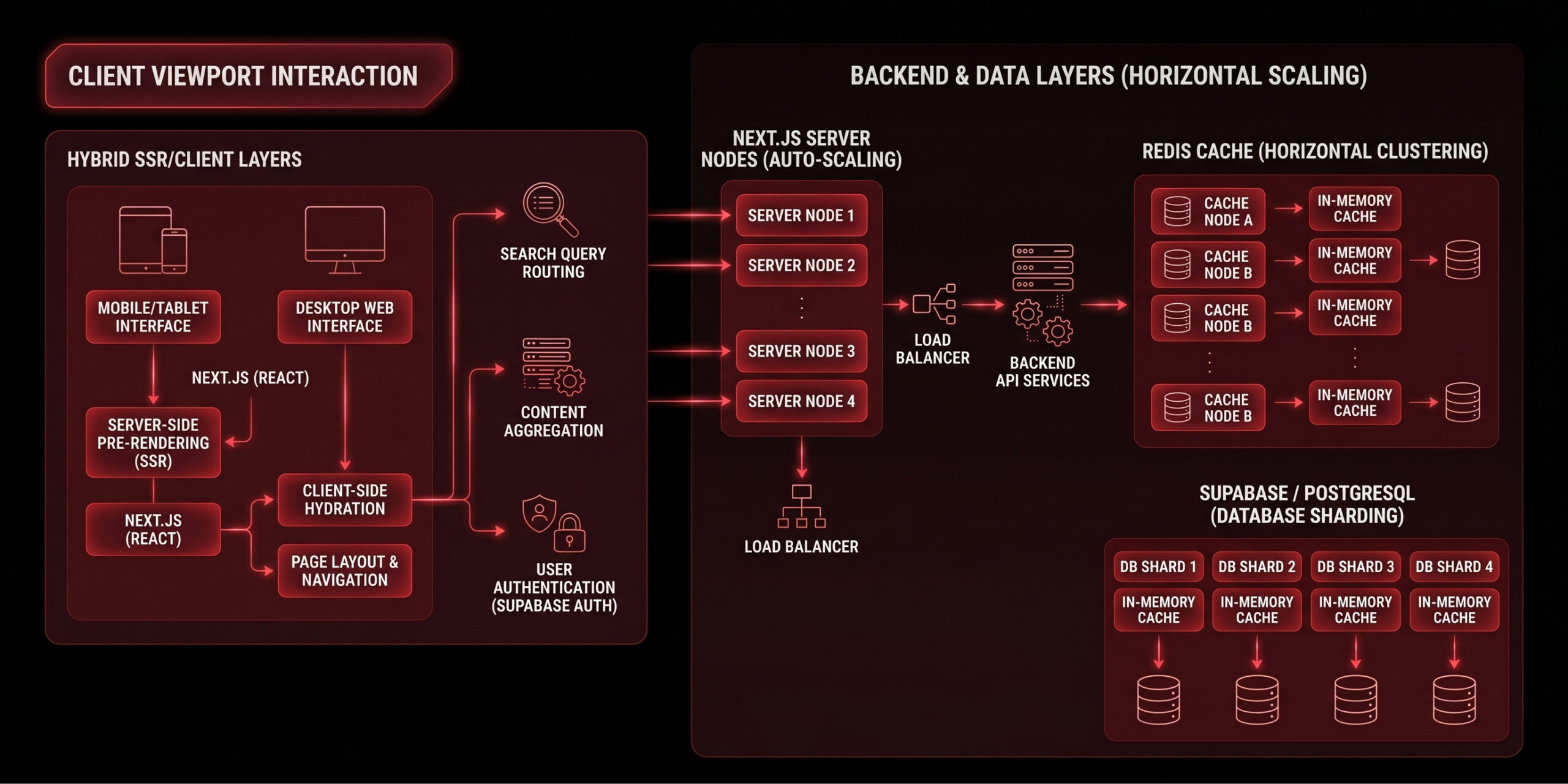
While the working prototype was rapidly validated within a tight, low-code sandbox environment, scaling MediPulse into a production-grade digital ecosystem requires an enterprise-tier architecture. To bridge the gap between high-density Information Architecture (IA) and engineering execution, the platform maps out a high-performance, low-overhead blueprint.
This specific configuration is widely recognized by backend engineers as the most reliable, modern framework for high-volume, read-heavy content systems.
The Architectural Layering
- The Framework Layer (Next.js App Router): Moving away from traditional client-side rendering, the core of the platform is designed around Next.js Server Components (RSC). By pre-rendering dense manuscript layouts (
/research/:id) into static HTML on the server, we eliminate heavy JavaScript execution on low-powered mobile devices and guarantee optimal SEO crawling for academic indexers like Google Scholar. - The Performance Caching Layer (Redis + Edge Middleware): Medical professionals expect sub-500ms data retrieval. Because scientific publications change infrequently once published, the read-heavy routes (
/articles,/research) are intercept-cached using a serverless Redis memory layer at the network edge. This minimizes active requests to the primary database, keeping infrastructure costs highly predictable. - The Persistence Core (Serverless PostgreSQL): To manage strict relational integrity—such as explicitly mapping a user’s unique ORCID identifier to their publication history, saved articles, and dynamic keyword configurations—the backend utilizes a serverless PostgreSQL database (driven by Neon or Supabase). This structure automatically scales connection pools to zero during idle periods, significantly reducing monthly maintenance overhead.
- The System Interaction Engine (Supabase Auth & Server Actions): User session persistence and security are isolated using cryptographically secure authentication routines. High-frequency user updates—such as the 800ms debounced auto-saves on the
/settingsdashboard—leverage Next.js Server Actions over secure web protocols, preventing layout lag and reducing front-end state complexi
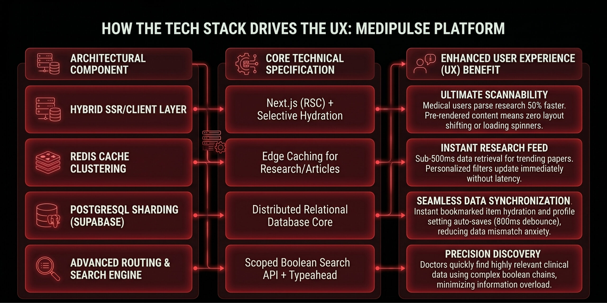
The Designer’s Rationale: Engineering as an Enabler of UX
From a design systems perspective, a product’s technology stack directly dictates the boundaries of the user experience. Choosing a highly optimized Next.js and PostgreSQL architecture allows the design to achieve its three primary UX priorities:
Target User Personas & Interaction Flows
To map out how different professionals navigate the high-density environment of MediPulse, we look at two distinct user personas. Their behaviors highlight why the interface requires both rapid mobile scannability and deep-dive desktop functionality.
Persona 1: Dr. Aris (50s) – The Busy Clinical Practitioner
- Context: A senior cardiologist with over 25 years of experience. He is highly protective of his time, suffers from mild visual fatigue at the end of long clinic shifts, and primarily reads breaking updates on his tablet or phone between patient consultations.
- UX Need: High-contrast text, large touch targets, zero fluff, and instant confirmation of paper authority.
The Interaction Flow
- Entry Point (The Mobile Alert): While reviewing patient charts, Dr. Aris receives a live server push notification via a subtle, high-contrast toast notification on his tablet indicating a major clinical trial release.
- First Interaction (The Active Feed): He taps the notification, which takes him directly to the
/alertsroute. The unread badge count in his navigation updates immediately, and the item displays a bold Alert Ochre badge signaling an urgent health update. - Information Parsing (The Core Reader): He clicks the alert to navigate to
/research/:id. Because he experiences eye strain, the layout leverages fluid typography to scale the manuscript body text up automatically, while a prominent Frosted Glass Card isolates the “Key Findings” at the top of his viewport. - Authority Verification: Before committing to reading the paper, his eyes scan the top metadata line. The interface prominently highlights the journal’s Impact Factor and its Peer-Review Status using clear, high-contrast typography, giving him instant confidence in the paper’s validity.
- Session Exit: He doesn’t have time to read the full text right now, so he hits the prominent, accessible bookmark icon to add it to his
/savedlist and copies the BibTeX citation to his clipboard with a single tap for later reference in his weekly department newsletter.
Persona 2: Elena (30s) – The Rapid UX Researcher & Academic
- Context: A tech-savvy digital health UX researcher working for a biomedical startup. She moves fast, keeps dozens of browser tabs open, uses complex boolean search chains, and relies on precise tracking of keywords to find relevant behavioral studies.
- UX Need: Powerful advanced filters, rapid keyword matching, and seamless multi-tasking across data listings.
The Interaction Flow
- Entry Point (The Control Room): Elena opens MediPulse on her desktop monitor and goes directly to the
/searchpage to find user-behavior papers on digital health tracking adherence. - The Discovery Cycle (Advanced Search): She inputs a complex query string using Boolean operators (
"telehealth" AND "engagement" NOT "pediatric"). As she types, the typeahead engine drops down immediate keyword suggestions. - Layout Refinement (The Filter Drawer): She opens the collapsible macro-filter panel. Using a series of clear interactive chips, she restricts her parameters to Study Type: Mixed Methods, Date Range: Past 2 Years, and selects a minimum citation count. The system displays an active filter count badge so she never loses track of her parameters.
- Data Aggregation (The Results Matrix): The system displays the refined results in under 500 milliseconds. Elena scans the search results page, where each research card clearly exposes its Open Access status and DOI link without her needing to click into the detail view.
- Session Exit (Profile Synchronization): She finds three critical papers, saves them to her unified account dashboard, and hops over to
/settingsto add “Behavioral Science” and “HCI” to her research keywords chip list. The system triggers an 800ms debounced auto-save, visually flashing an inline success indicator to confirm her profile is synchronized for future personalized feed curation.
Content Strategy & Information Architecture (IA) Framework
The core challenge of managing scientific literature is navigating its inherent data density and complex categorization. Legacy research archives often fail because they treat users like search engines, forcing them to guess exact terminology within bloated directories. The Information Architecture of MediPulse introduces a flattened, user-centric structure designed around specific content consumption mindsets: general awareness, deep evaluation, and personalized tracking. By cleanly separating content layers, the platform simplifies high-density navigation while preserving the underlying relationships between an editorial news story and its original, peer-reviewed source paper.
To achieve this cognitive balance, the system organizes its data routes into distinct behavioral zones. The Aggregation Layer (/) serves as a macro-hub, presenting featured editorial content and trending carousels to capture high-level breaking news. Beneath this, the interface splits into the Curated Layer (/articles), which distills consumer-friendly digests and health alerts for quick updates, and the Empirical Layer (/research), which gives academic researchers full access to raw manuscripts, active filter chip selection metrics, and complex boolean query inputs. This explicit mapping effectively prevents information overload, guiding different user personas down their ideal discovery pathways with zero friction.